Technical Analysis
- Written By thinkforexbrokers
- Updated:
Technical analysis is a method of evaluating markets by examining statistical data, such as past prices and trading volumes. Unlike fundamental analysts, who try to assess the intrinsic value of an asset, technical analysts—often called technicians—focus on interpreting price charts and other tools to identify patterns that may indicate future market movements.
At its core, technical analysis is about understanding market supply and demand to predict trends and potential price directions. It can be applied to virtually any asset with historical trading data, including stocks, foreign exchange, commodities, indices, cryptocurrencies, bonds, and futures.
This approach is based on three main assumptions:

The first assumption is that the price reflects everything. Technical analysts believe that, at any given moment, the price of an asset already incorporates all factors that could influence the market—including fundamental elements. For example, in the stock market, the price of a stock is thought to account for the company’s financial health, broader economic conditions, and even investor sentiment. This means that analysts don’t need to evaluate each of these factors individually, as they are already “built into” the price.

The second assumption is that prices tend to move in trends. Once a trend is established, future price movements are more likely to continue in the same direction rather than reverse. In other words, if an asset is trending upward or downward, it usually maintains that trajectory for some time, making trends a key focus for technical analysts.

The third assumption is that history tends to repeat itself, especially when it comes to price movements. This is largely driven by market psychology—investors often react in similar ways to similar market events over time. Technical analysts use chart patterns to study these movements and spot trends, as charts often reveal recurring patterns that can help predict future price behavior.
Advantages and disadvantages of technical analysis
One of the main strengths of technical analysis is that it relies very little on fundamental data. For a technician, almost every piece of news or macroeconomic report is already reflected in the market price. This means traders don’t have to wait for monthly or quarterly economic figures or seasonal events—they can make decisions based on the information already embedded in the charts.
Another major advantage is that technical analysis provides a quick snapshot of the market. All the essential information—price movement, trading volume, and open interest—is available in a single chart. By using the right analytical tools, a trader can quickly assess whether a trade is worth taking, estimate potential profit targets, and define risk management levels within minutes.
However, there are some limitations. One key caution is that many technical strategies rely heavily on lagging indicators. While these tools reflect past and current market events, they can’t reliably predict future movements on their own.
Additionally, since technical analysis tools are widely accessible, traders are competing against everyone—from beginners to seasoned experts—using the same methods. When many traders follow similar strategies, areas like stop placements and support or resistance zones can become predictable, making price movements somewhat foreseeable. To gain an edge, traders need to refine both their tools and their overall strategy.
Finally, success in technical analysis comes down to interpretation. There’s no single “wrong” way to analyze the data, but there are certainly more effective ways. Traders who can interpret technical indicators more skillfully than others are the ones who can truly capitalize on market opportunities.
IIn the current guide, we will focus on some key concepts in technical analysis, explore popular technical indicators, and look into commonly observed chart patterns.
The concept of a market trend
When we refer to a trend, we’re talking about the overall direction in which market prices are moving. Traders can use these directional trends—whether upward or downward—to generate profits by applying strategies that follow the trend.
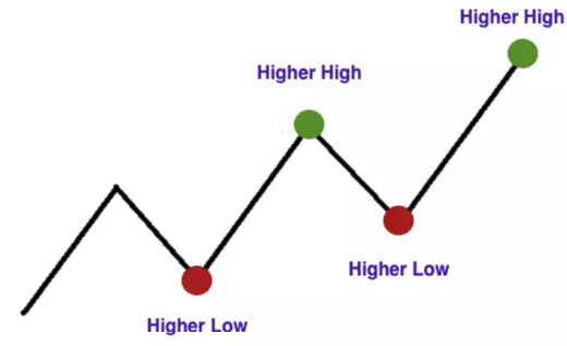
An uptrend, also known as a bull trend, occurs when prices consistently form higher highs and higher lows, signaling a market that is moving upward.
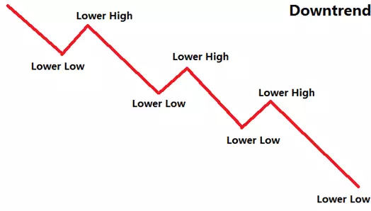
A downtrend (bear trend) can be observed when the price registers lower peaks and lower troughs.
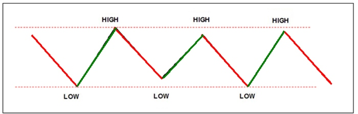
A sideways trend, also called a flat trend or trading range, occurs when prices move within a defined range without showing any significant upward or downward movement. In other words, the price tends to hover around the same level. This type of market behavior often appears when a larger trend has paused temporarily, creating a period of consolidation.
It’s important to note that trend-following strategies are most effective during clear bull or bear trends, but they often underperform in sideways or flat markets. To navigate such trading ranges, many technical traders rely on price oscillators to identify potential opportunities.
Price movements are rarely smooth or continuous. Short countertrend moves can occur within a larger trend, making it more challenging to identify the underlying direction. Trends also vary in duration—short-term trends often exist as part of longer-term trends. From a technical analyst’s perspective, a trend is any directional price movement that lasts long enough to be identified and acted upon.
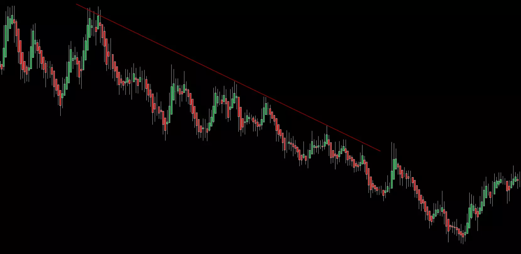
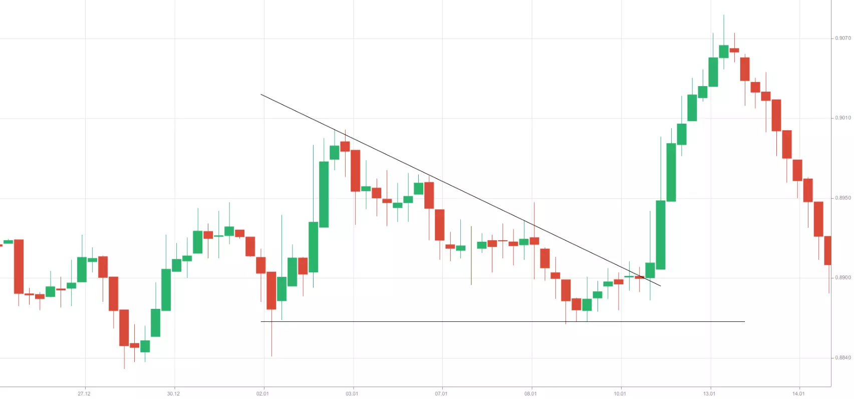
Some analysts use moving averages to smooth out short-term fluctuations, which helps them spot longer-term trends more clearly. Others study price charts by identifying significant peaks and troughs separated by time intervals, connecting these points to form trend lines. Trend lines help traders gauge price direction and potential boundaries. A break of a trend line often signals a possible trend reversal.
To chart a downtrend, traders typically draw a trend line above the price action, connecting price highs. For an uptrend, the line is drawn below price action, connecting price lows. At a minimum, two swing highs or lows are needed to draw a trend line, but a reliable trend line is usually confirmed by at least three peaks or troughs. By using these methods, traders can better understand market direction and make informed decisions.
The concept of support and resistance
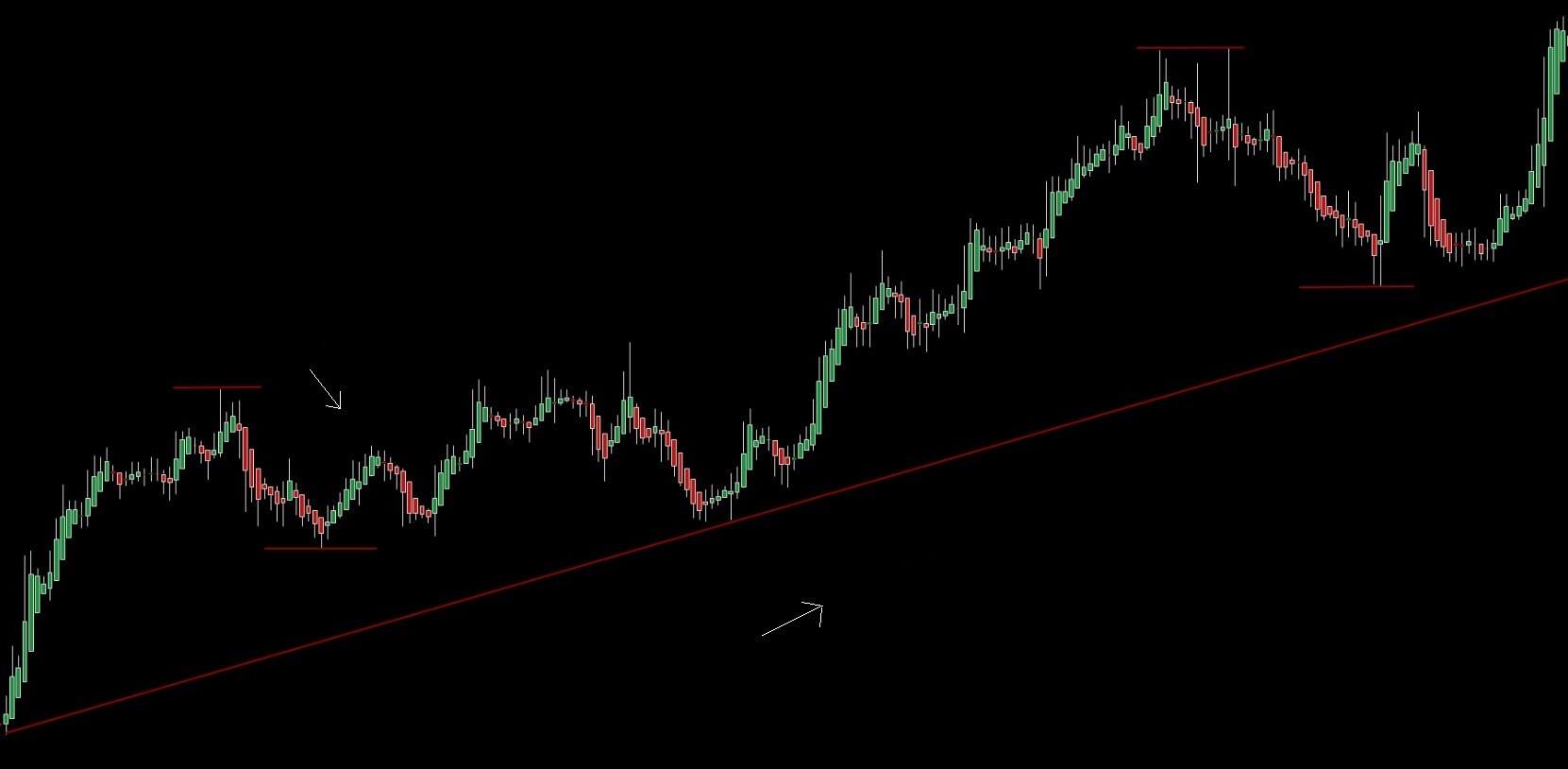
Price points that carry significant importance based on historical data—where market movements often pause or reverse—are known as support and resistance levels.
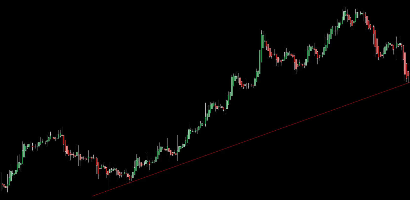
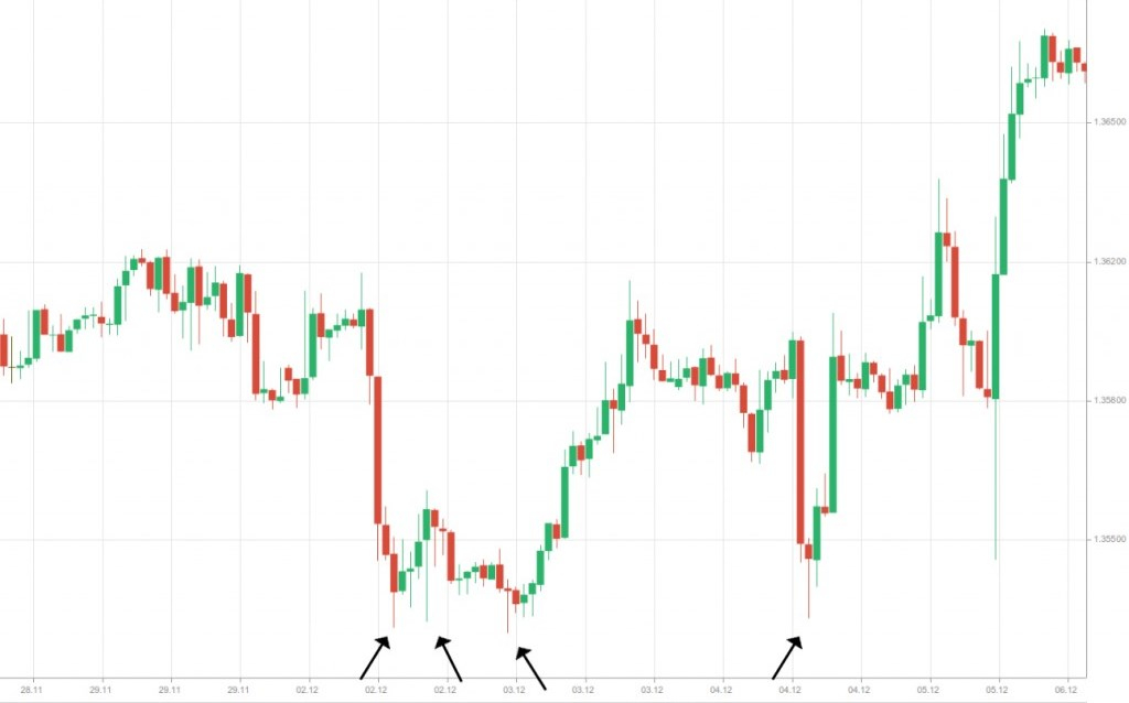
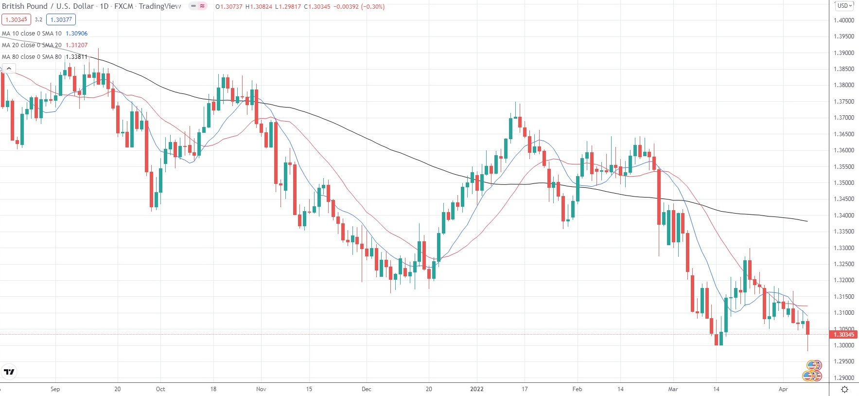
A support level represents the lowest point reached during a downtrend, often forming at a single low. At this level, selling pressure meets “buying support,” as buyers step in and the downward momentum slows. Traders often view support levels as potential entry points for long positions or as targets for closing existing short trades.
Conversely, a resistance level marks the peak of an uptrend, where buying pressure from bulls is met by selling pressure from bears. When bears take control, the price tends to pull back from this level. Resistance levels often serve as signals for traders to enter short positions or as targets for exiting existing long positions.
To identify support or resistance, traders examine charts for significant highs or lows, or levels where the market has repeatedly stalled and reversed direction. Recognizing these levels helps traders anticipate potential price behavior and make informed decisions.
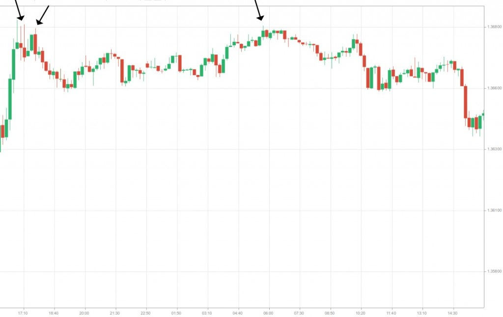
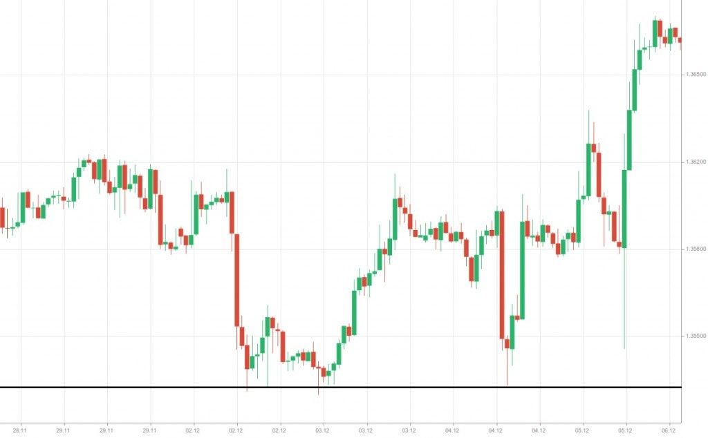
We can observe that upward price movements have repeatedly paused and reversed at clear resistance levels, signaling points where selling pressure overcomes buying momentum.
Conversely, in the chart below, downward price movements have been consistently halted and reversed at distinct support levels, indicating areas where buying interest outweighs selling pressure.
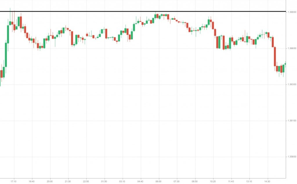
Once support and resistance levels are identified, the next step is to visualize them for practical use. This is done by drawing a horizontal line across the level where price movements have historically reversed, making it easier to track and act upon these critical points in future trading.
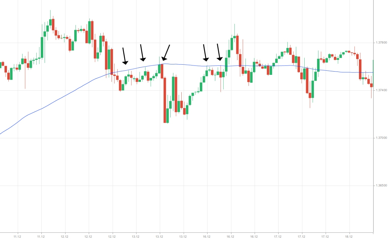
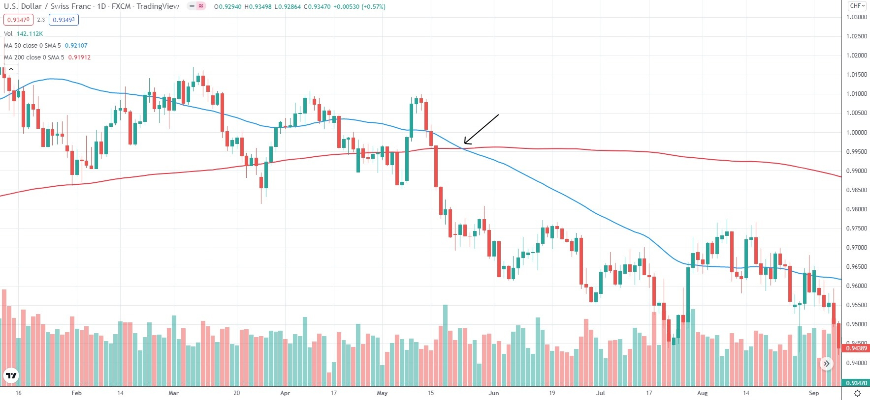
Moving averages can also act as dynamic levels of support and resistance. In a downtrend, when prices approach a moving average from above, they often bounce off it. However, if prices break below the moving average and continue to decline, it can serve as a strong signal to enter a short position.
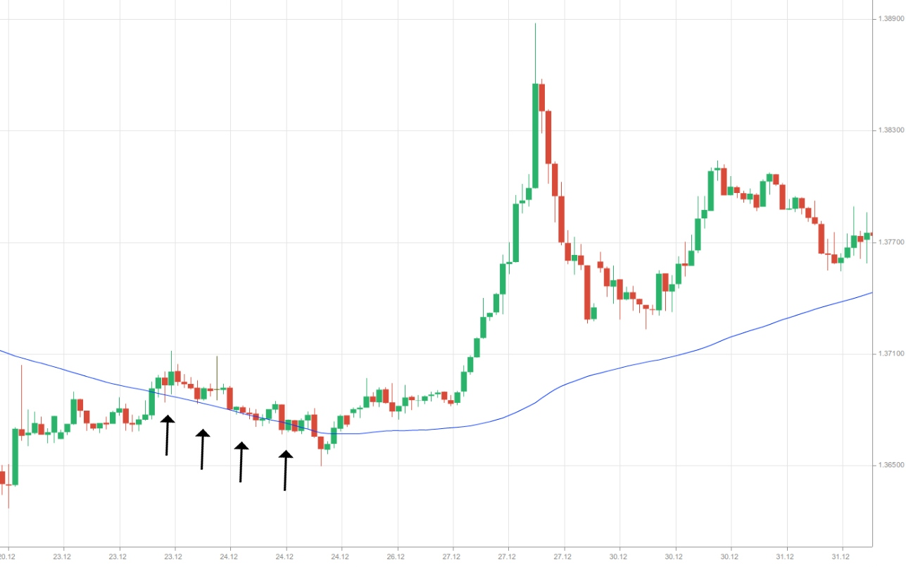
In an uptrend, when prices approach a moving average from below, they often encounter resistance at that level. However, if prices break above the moving average and continue rising, it can serve as a strong signal to enter a long position.
Breakouts
Breakouts typically happen when the price moves below a previous support level or above a previous resistance level and continues in that direction. They signal a notable shift in supply and demand for the asset and often mark the start of a new trend.
When a breakout occurs in the direction of the existing trend, it usually confirms that the trend is still intact. Conversely, a breakout against the current trend often suggests a potential reversal, prompting traders to exit positions or even consider reversing them.
Breakouts generally hinge on two key factors. First is the penetration of a prior trend line or a support/resistance zone. Second is confirming that this penetration represents a genuine breakout rather than a temporary “fakeout.”
For support or resistance zones, the exact breakout point may not be precise, but the extreme of the zone can serve as a reference. Trend lines, however, often provide a more accurate breakout level. Traders may wait for a breakout candle to close—or even two or more candles—to confirm that the trend line has been truly breached.
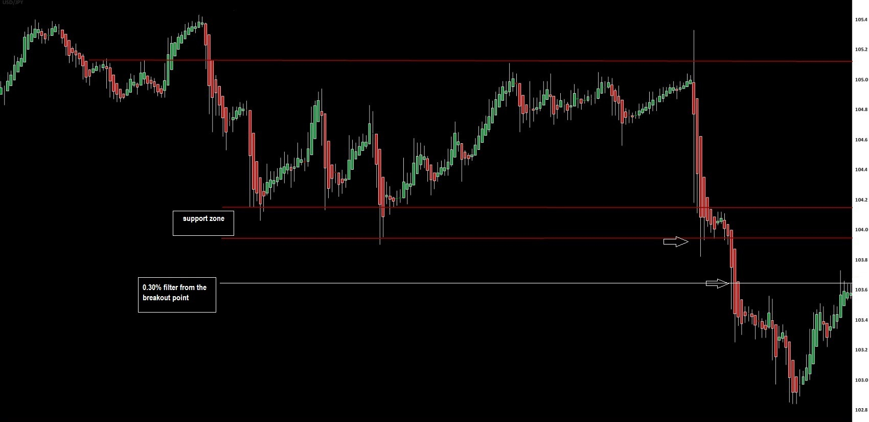
Other confirmation methods exist as well. For instance, traders may define a breakout zone slightly beyond the breakout level. If the price penetrates both the breakout level and this additional zone, it is likely a valid breakout. In practice, stock traders often use the 3% rule, treating a price move 3% beyond the breakout level as confirmation.
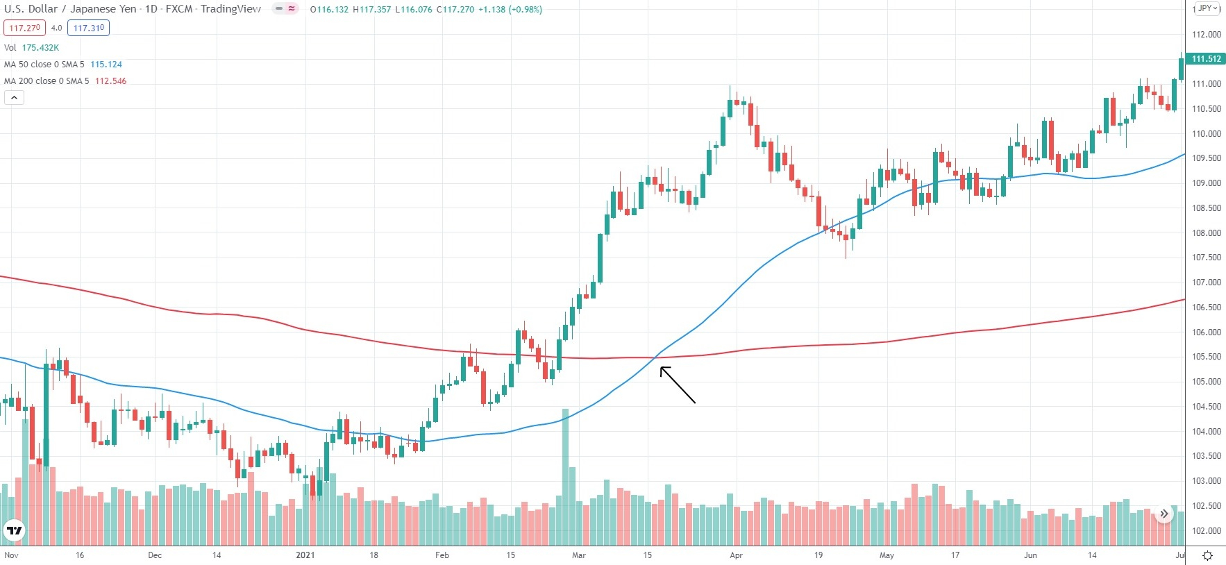
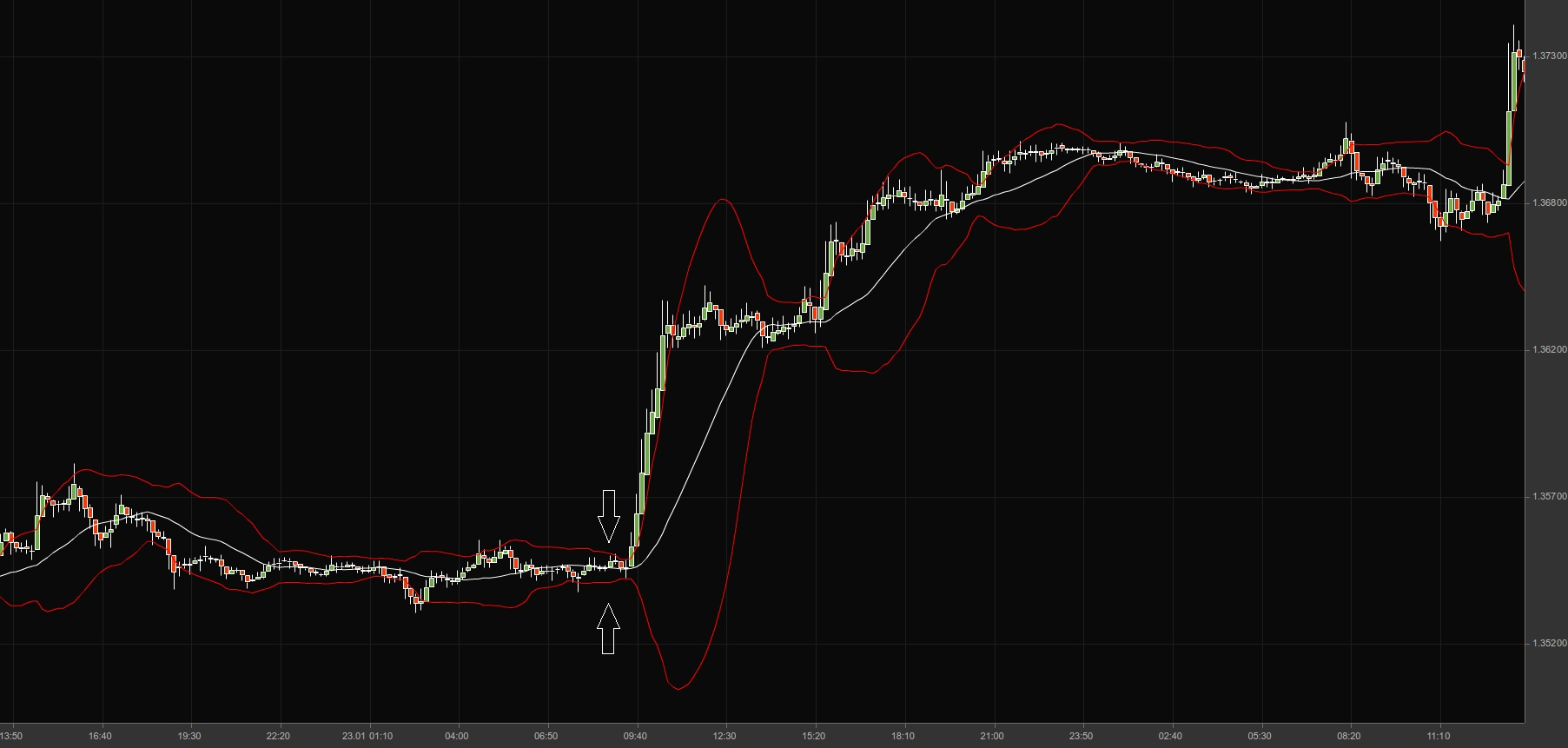
In the 1-hour USD/JPY chart below, a 0.30% filter from the breakout level is applied to confirm the move.
Retracements (corrections to the principal trend)
A retracement, or correction, is a temporary reversal in price that moves against the main trend. Unlike a full trend reversal, which signals the end of the current trend and the start of a new one, retracements are short-term pullbacks within an ongoing trend.
In a strong uptrend, price advances are often interrupted by brief bearish corrections. These typically start at a resistance level and end near a support level. Retracements are essentially smaller trends running counter to the primary trend.
During a solid bull trend, retracements are generally shallow and do not erase a large portion of the previous gains. In strong uptrends, these pullbacks usually stay below 50% of the prior rise. The same principle applies in downtrends, where corrections against the main downward movement are similarly limited.
In an uptrend, if a retracement erases more than 50% of the prior advance, the long-term trend line may lose its significance. In this way, the depth of retracements can serve as an indicator of the overall strength of the primary trend.
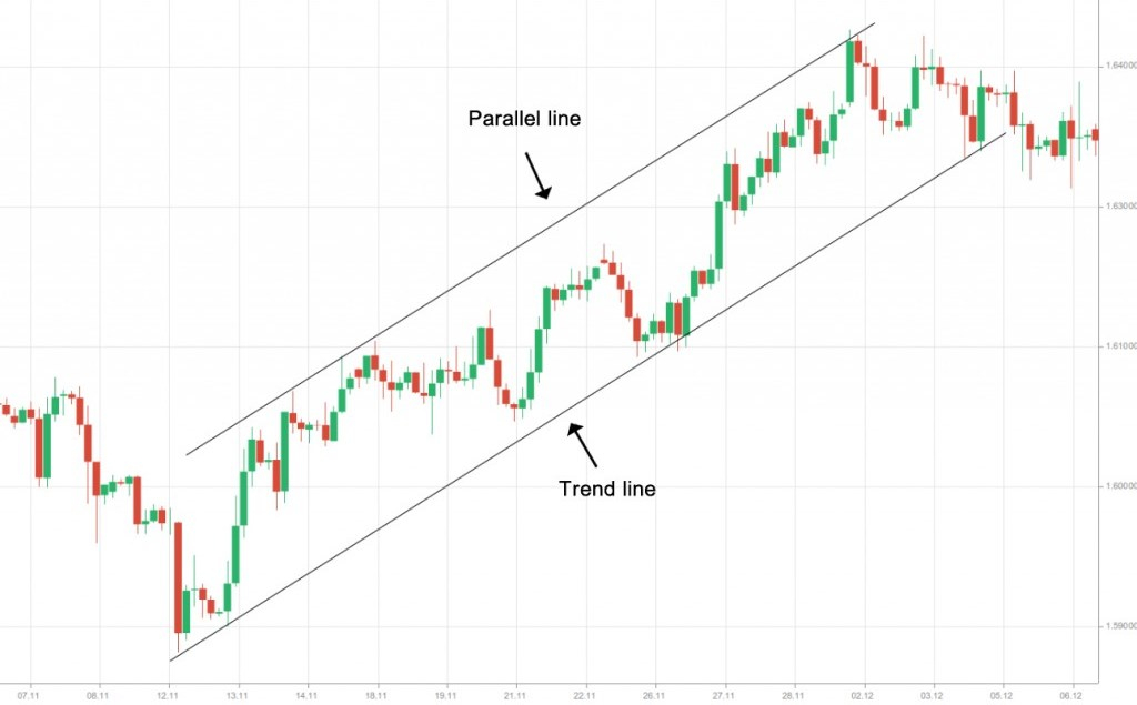
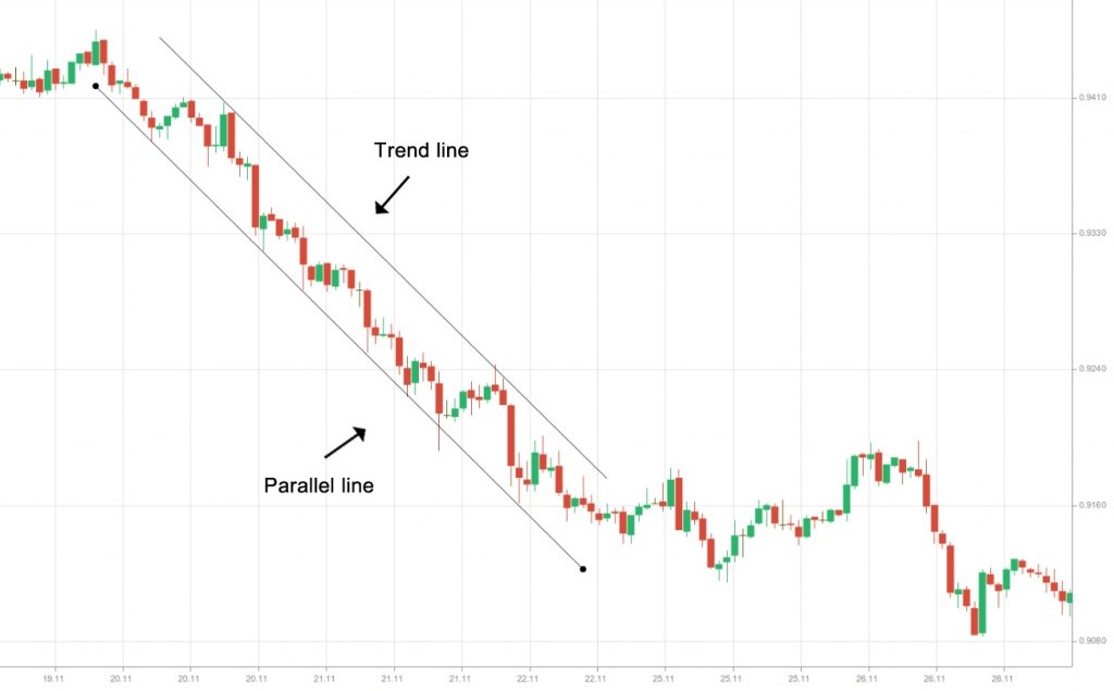
Channels
Channels are trading ranges outlined by a trend line and a parallel line drawn through price highs and lows. Depending on the direction of price movement, channels can be classified as ascending, descending, or sideways.
Ascending channels, also called upward channels, occur when prices consistently make higher highs and higher lows at a relatively steady pace, creating an upward-sloping range.
To construct an ascending channel, traders typically follow a few straightforward steps:
First, place a trend line as discussed earlier in the guide
Second, place another line with the same angle and adjust its length according to the channel projection
Third, drag the concurrent line and plot it so it can run through the nearest high

Fourth, if we have a real ascending channel, all the prior highs will lie on the concurrent line (or deviate from it very slightly)

Fifth, you should not try to forcefully make the second (clone) line appear parallel to the trend line. In case of a mismatch, there simply is no channel
Descending channels, or downward channels, occur when prices consistently form lower highs and lower lows at a relatively steady pace, creating a downward-sloping trading range.
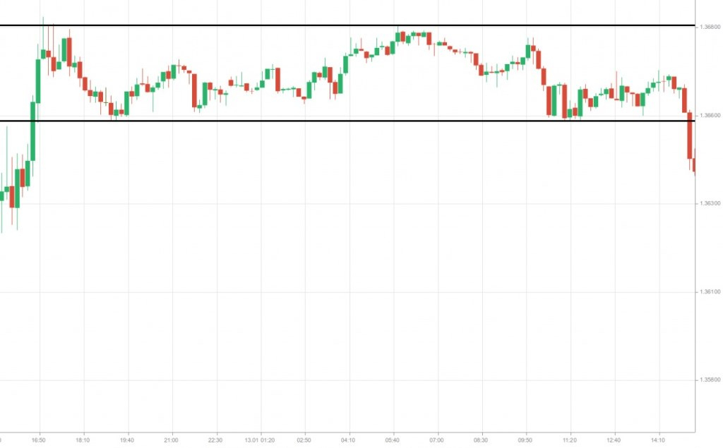
Horizontal channels, also called sideways channels, occur when prices move within a range without any noticeable slope. In this case, the price fluctuates between horizontal support and resistance levels, creating a flat trading range.
Pivot levels and how they are used
Pivot levels, or pivot points, are a popular tool among day traders for identifying likely support and resistance levels. They can also help confirm breakouts from trading ranges.
Every tradable asset records four key price points each trading day: the opening price, the high, the low, and the closing price. These values are used to calculate pivot points.
Traders favor this method because pivot levels are predictive—they highlight potential turning points for the trading session. Since markets often react around these levels, pivot points can serve as practical guides for entering or exiting positions. The calculation formula for pivot points is as follows:
Pivot Point = (High + Close + Low)/3
Once you know the Pivot Point (PP), you can easily calculate the resistance and support levels:
Resistance 1 = (2 * PP) – Low
Support 1 = (2 * Pivot) – High
Resistance 2 = PP + (High – Low)
Support 2 = PP – (High – Low)
Resistance 3 = High + 2*(PP – Low)
Support 3 = Low – 2*(High – PP)
By using the high, low, and closing prices of an asset from the previous trading day, traders can calculate seven key points for the current session: the main pivot point, three support levels, and three resistance levels.
If the market opens above the pivot point, the session is generally biased toward long (buy) trades, as long as the price remains above the pivot. Conversely, if the market opens below the pivot, the bias tends to favor short (sell) trades, provided the price stays below the pivot.
Traders often watch for potential reversals or breaks at the first support (S1) or resistance (R1) levels. When prices reach higher levels such as R2 or R3—or lower levels like S2 or S3—the asset is typically considered overbought or oversold. These levels are usually used to exit trades rather than to initiate new positions.
An ideal scenario would be if the market opens above the pivot, stalls briefly at R1, and then continues rising toward R2. Traders might enter a position after a break above R1, set a profit target at R2, and exit half of their position at that point. The remaining portion can then be held with a target of R3, where the trade is closed completely.
The main advantage of the pivot point technique is its consistency—many traders use the same formula, creating predictable reactions around these levels. In contrast, manually drawing support, resistance, or trend lines can be more subjective and vary from trader to trader.
Simple Moving Average (SMA)
Moving averages are powerful tools that help smooth out daily price fluctuations, allowing traders to focus on the underlying trend without being distracted by short-term market noise.
A rising moving average typically signals a bullish trend, while a declining moving average indicates a bearish trend. Many traders use a simple approach with Simple Moving Averages (SMAs): if an asset closes above the SMA, it is often considered to be in an uptrend; if it closes below, it may be in a downtrend.
The choice of SMA period—or length—depends on the trader’s personal preference, trading style, and time frame. Determining the most suitable period usually requires experimentation and experience.
While SMAs are useful for identifying trends, they only reflect movements once a trend has already begun. This is why moving averages are considered lagging indicators, as they are based on historical prices.
Moving averages can be calculated over various time spans. Common daily SMAs include 10, 20, 30, 50, 80, and 200 days. For example, a 10-day SMA covers roughly two weeks of trading, a 20-day SMA represents about one month, and an 80-day SMA spans roughly four months of market data.
Longer-term moving averages tend to respond more slowly to changes in market trends. However, they are less likely to produce false signals, since they incorporate a larger set of data points. The more data included in the calculation, the less impact a single day’s price movement will have on the overall average. This makes longer-term SMAs more reliable for identifying sustained trend changes while filtering out short-term volatility.
Exponential Moving Average (EMA)
Simple Moving Averages (SMAs) have faced criticism due to the so-called “drop-off effect.” If the most recent price shows little change while the oldest price being removed from the calculation had a significant change, the SMA can be noticeably affected. SMAs completely ignore older data once it falls outside the chosen period.
To address this limitation, traders often use Exponential Moving Averages (EMAs). Unlike SMAs, which treat each day’s data equally, EMAs assign more weight to recent prices and less weight to older data. This makes EMAs more responsive to current market movements while still considering historical trends.
The chart above shows a 10-day SMA (black) and a 10-day EMA (blue). The EMA responds more quickly to price changes than the SMA because it gives greater weight to recent data. Over the past four days, the EMA has moved below the SMA, reflecting the clear downtrend during this period and capturing the latest market sentiment more accurately.
Earlier, during the first 12 days (marked by 12 consecutive green candles on the left), the EMA stayed above the SMA and adjusted more swiftly when the trend shifted to eight consecutive red candles. This responsiveness allows the EMA to better represent traders’ actions and market sentiment compared to the SMA.
Moving Average Crossovers
Traders typically don’t rely on moving averages alone to make decisions. Instead, they often look for one of the most reliable signals: the moving average crossover. This occurs when a short-term moving average crosses through a long-term moving average, signaling a potential shift in market momentum.
A bearish (sell) signal happens when the short-term MA crosses below the long-term MA, while a bullish (buy) signal occurs when the short-term MA crosses above the long-term MA.
One notable example is the “Golden Cross,” which signals a major shift in market sentiment toward bullish dominance. This pattern appears when a medium-term moving average, such as the 50-day MA, moves above a long-term moving average, like the 200-day MA.
The “Death Cross” is another occurrence that signifies a major shift in sentiment when bears dominate the market. This cross can be observed when a medium-term MA (50-day MA) moves below a long-term MA (200-day MA).
When the 200-day moving average is breached, it can act as a key level: serving as resistance during a Death Cross scenario or as support during a Golden Cross scenario. Price action often moves between medium-term and long-term MAs, offering opportunities for swing traders to capitalize on these fluctuations.
MA crossovers are frequently used as confirmation tools in various trading strategies. However, it’s important to remember that moving averages are trend-following indicators—they reflect directional momentum. In sideways or flat markets, MAs become less effective because the averages converge around a single price level. When price movements are particularly thin, resembling a flat line, moving averages provide minimal guidance on market direction.
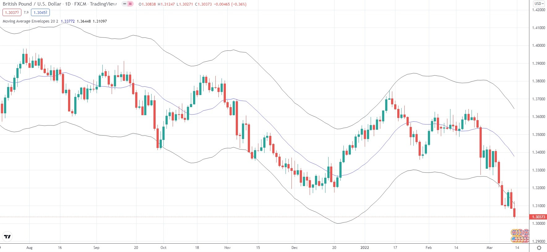
Moving Average Envelopes
Envelopes are created by plotting two boundaries at a set distance above and below a moving average. When prices move too far from the moving average and touch one of these boundaries, it often indicates that the market is overextended. Such extreme moves are typically unsustainable and may trigger a price correction.
Short-term moving averages, like the 20-day MA, are usually paired with a narrow envelope of around 3% or less. Medium- and long-term moving averages often use wider envelopes, typically 5% or more, to account for larger price fluctuations over time.
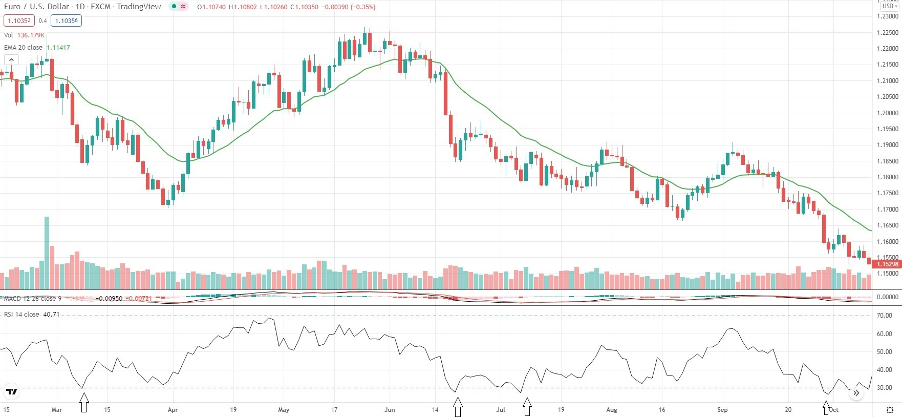
Relative Strength Index (RSI)
The Relative Strength Index (RSI) is an oscillator that helps identify overbought and oversold conditions by comparing recent gains to recent losses for a trading instrument.
Traders can use the RSI to generate entry and exit signals, spotting potential trend reversals or the start of new trends. It measures the upward versus downward momentum over a set period—typically 14 periods by default—indicating whether a market has moved too far in either direction.
The RSI ranges from 1 to 100, with 50 serving as a key midpoint separating bullish and bearish conditions. Other important levels are 30 and 70: readings below 30 suggest oversold conditions, while readings above 70 indicate overbought conditions. These thresholds are adjustable depending on a trader’s strategy.
An RSI above 50 signals that buyers are in control, pushing prices higher, whereas a reading below 50 indicates that sellers dominate, driving prices lower.
The RSI is best used as a trend-confirmation tool. For example, if you anticipate a new uptrend forming, an RSI reading above 50 can reinforce your confidence in the market’s direction.
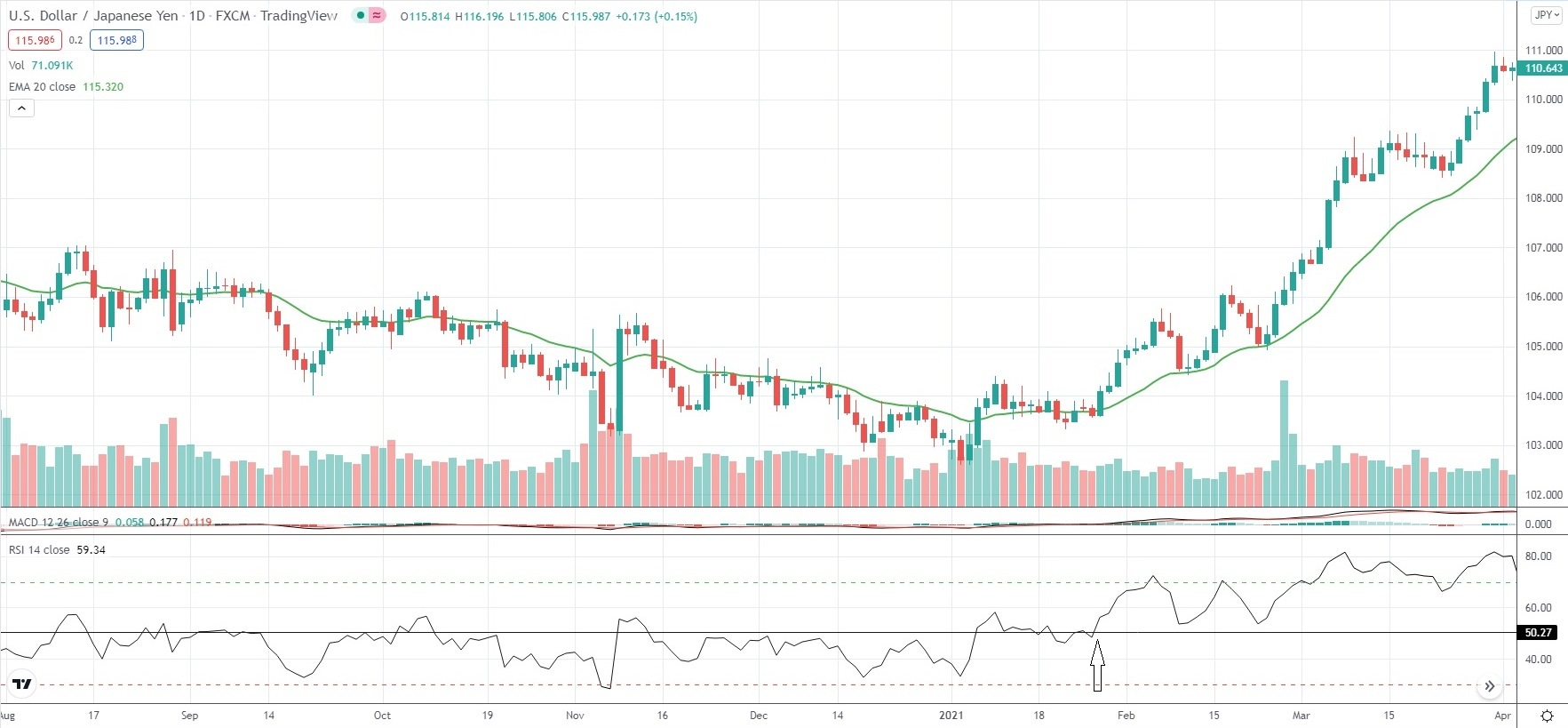
Traders often pay particular attention when the RSI nears its overbought or oversold zones. Overbought conditions suggest that buying pressure is waning and there may not be enough buyers to push prices higher, often causing upward momentum to stall. Conversely, oversold conditions indicate that selling pressure is diminishing, with insufficient sellers to drive prices lower, which can slow or halt downward movement.
When the RSI reaches the area near its oversold level (30), it is quite likely that downward price movement will slow down and even reverse to the upside.
We can say that overbought/oversold levels tend to act as areas of support/resistance.
Standard Deviation Technical Indicator
The Standard Deviation indicator measures the extent of recent price movements for a trading instrument and is commonly used to anticipate future volatility. Very high readings suggest that the asset has experienced significant price swings, but volatility may soon decrease. Conversely, very low readings indicate subdued price movement, often signaling that volatility could pick up in the near future.
Essentially, the indicator reflects how far prices deviate from the moving average. When standard deviation is low, it may hint at an upcoming surge in market activity, while extremely high values suggest that price movements could soon stabilize or slow down.
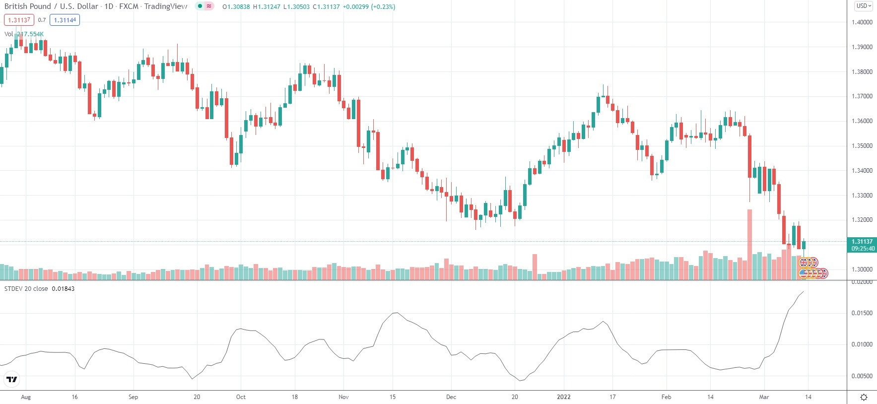
Traders often use the Standard Deviation indicator to anticipate price reversals through the principle of “reversion to the mean.” This concept assumes that any deviation from the average price will eventually return to that average, helping maintain a balanced price distribution.
The indicator is particularly useful in trending markets with moderate volatility, where price movements tend to cluster around the midpoint of a range.
For example, if the EUR/USD pair trades between 1.1000 and 1.2000 for an extended period and most activity occurs near the center of that range, a trader could place trades expecting prices to revert toward the mean.
However, if price activity is concentrated near the edges of the range—say between 1.1000–1.1100 or 1.1900–1.2000—the distribution may not be standard. In such cases, relying on the Standard Deviation indicator for trading decisions may be less effective.
Moving Average Convergence Divergence (MACD)
The MACD (Moving Average Convergence Divergence) is a popular indicator that helps traders gauge price direction, identify potential trend reversals, and measure the strength of market movements. It calculates the difference between the 12-period EMA and the 26-period EMA of a given asset, both based on closing prices.
Additionally, a 9-period EMA—known as the signal line—is plotted to help identify entry and exit points. A buy signal occurs when the MACD crosses above the 9-period EMA, while a sell signal is generated when the MACD crosses below it.
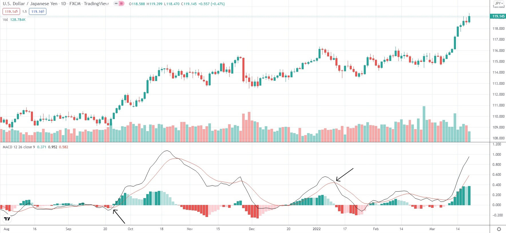
The MACD histogram provides a clear visualization of the difference between the MACD line and its 9-period EMA (signal line). The histogram stays positive when the MACD is above the signal line and turns negative when the MACD is below it.
During an uptrend, the histogram expands as price momentum accelerates and contracts when momentum slows. The opposite applies during a downtrend. For this reason, many traders use the MACD to assess the strength of market momentum.
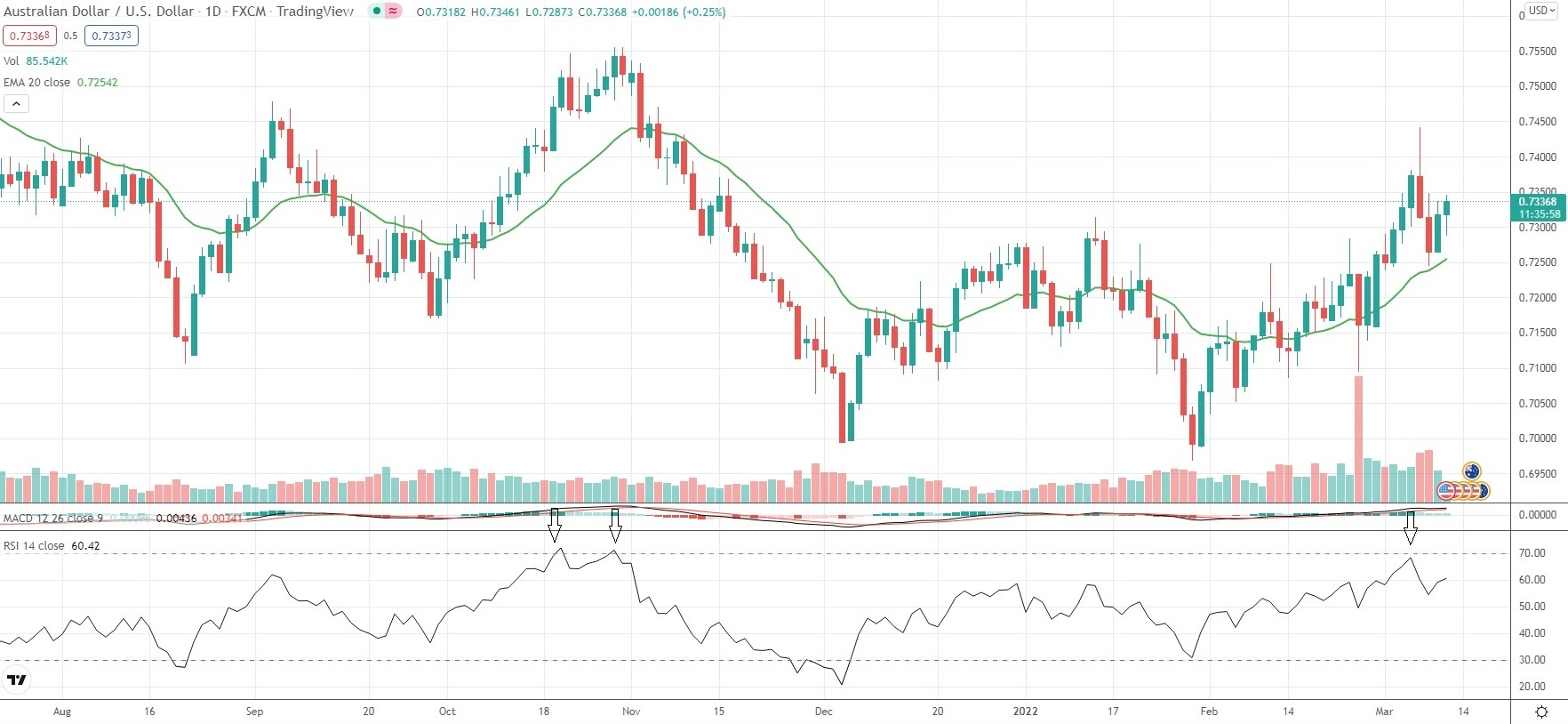
Traders also use the MACD histogram to identify divergences. A divergence occurs when the price reaches a new swing high or swing low, but the MACD histogram does not follow suit, signaling a potential mismatch between price movement and momentum that may indicate a trend reversal.
Bollinger Bands
Bollinger Bands are a type of oscillating indicator used to measure market volatility. Traders use them to anticipate potential price reversals when an asset moves to relatively high or low levels compared to its recent average. Bollinger Bands consist of three main components:
- an upper band that indicates if the instrument has become overbought
- a lower band that signifies if the instrument has become oversold
- a middle band that is usually the instrument’s 20-period Simple Moving Average
When the price approaches the upper Bollinger Band, the asset is considered overbought, meaning it is trading relatively high compared to its recent average. This often generates a bearish signal, as the price is likely to revert toward the moving average. Traders typically respond by closing long positions and may consider opening short trades.
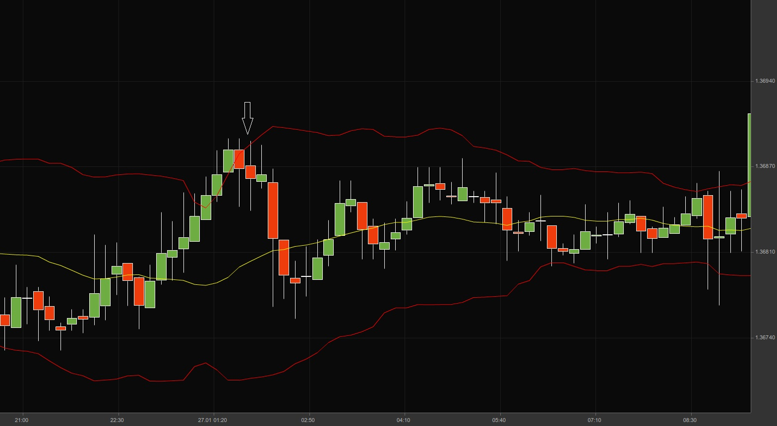
When the price approaches the lower Bollinger Band, the asset is considered oversold, meaning it is trading relatively low compared to its recent average. This typically generates a bullish signal, as the price is expected to rebound toward the moving average. Traders often respond by closing short positions and may consider opening long trades.
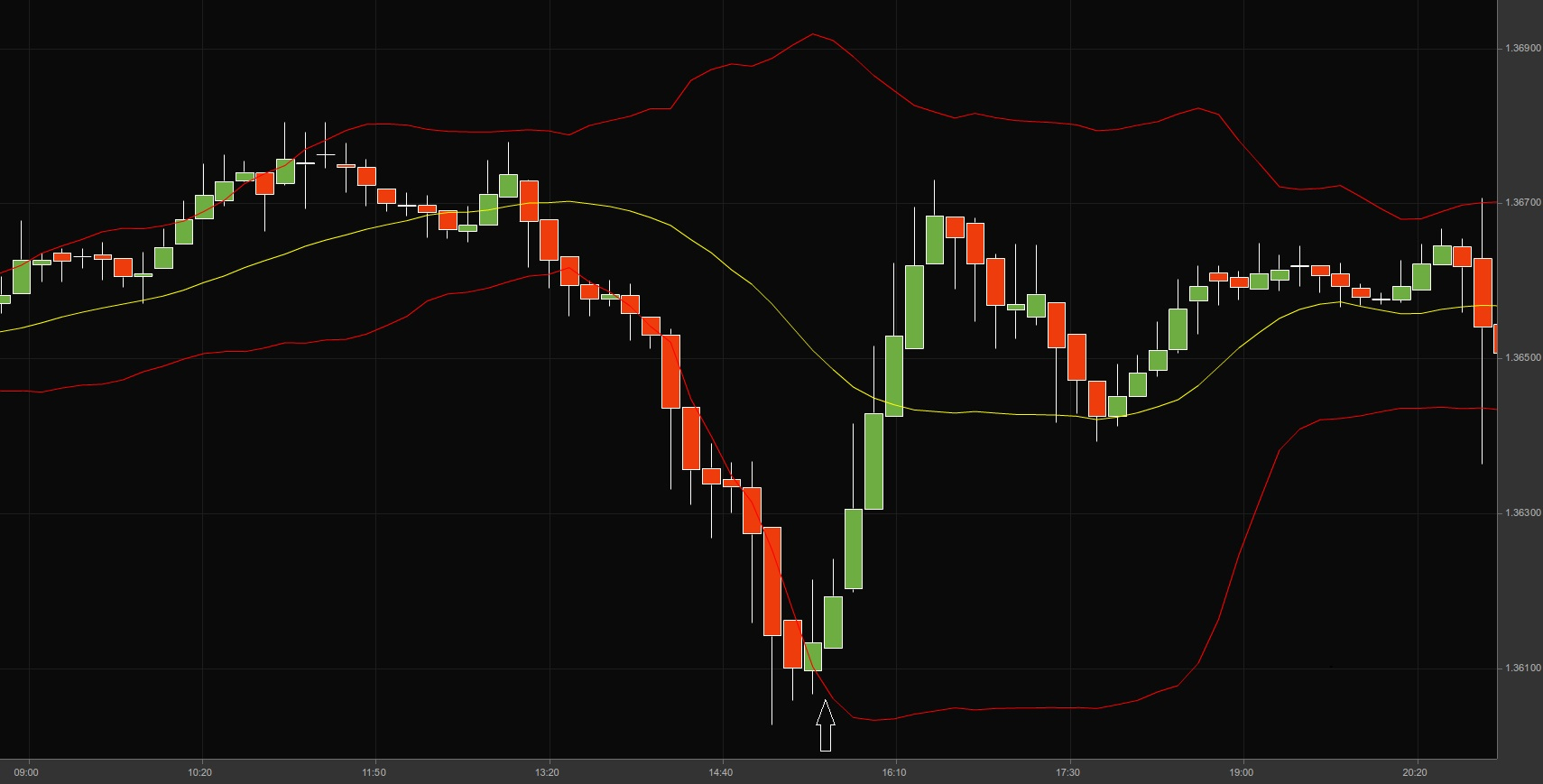
Traders typically don’t rely solely on Bollinger Bands to make trading decisions. Just because the price touches the upper or lower band doesn’t guarantee a reversal. Additional confirmation, such as candlestick patterns or other technical indicators, is often needed before placing trades.
Sometimes, the distance between the bands narrows—a phenomenon called a “Bollinger squeeze.” This often signals that a breakout is imminent. If the price breaks above the upper band, the upward move is likely to continue, while a breakout below the lower band often suggests a continuation of the downward move.
The chart below illustrates a Bollinger squeeze followed by a breakout to the upside.
Double Top, Double Bottom
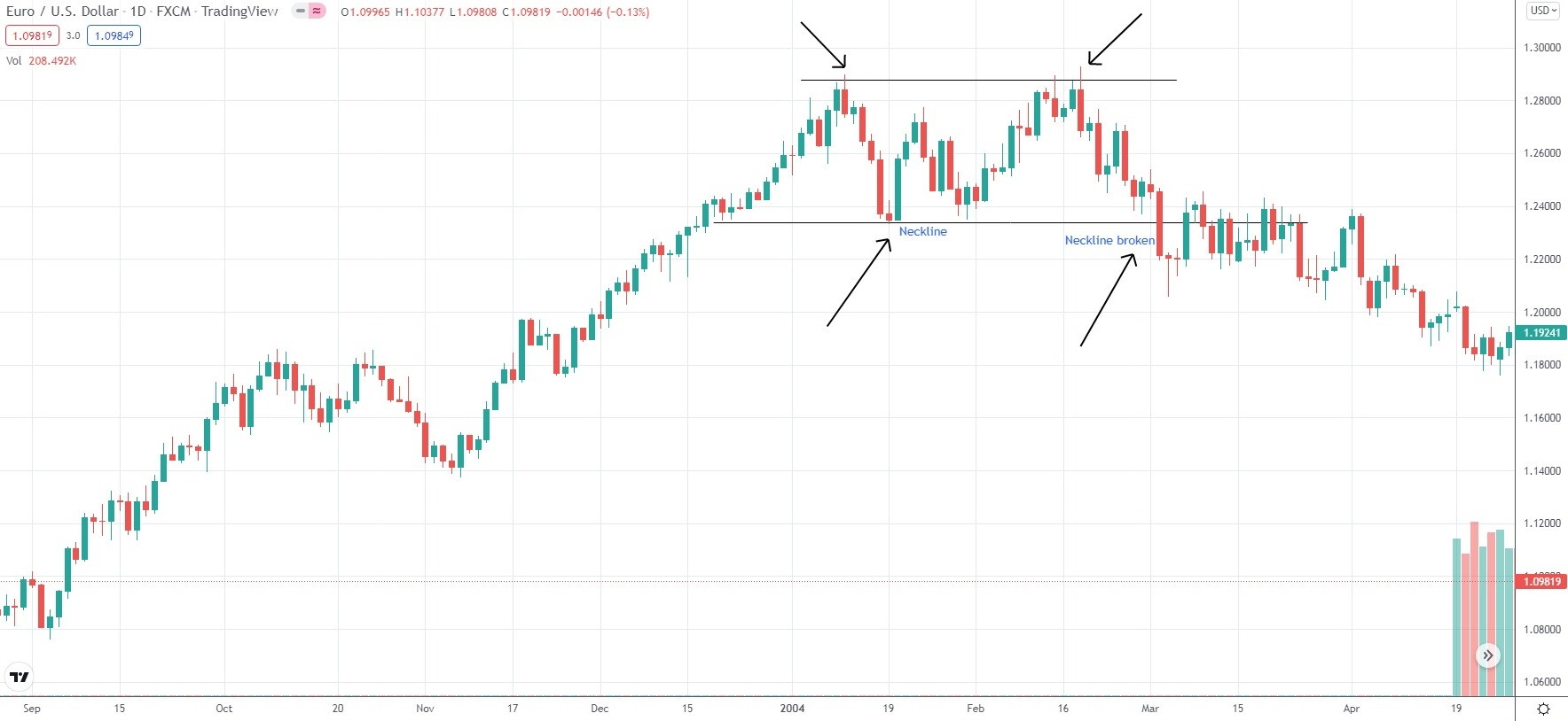
The Double Top is a bearish reversal pattern that resembles the letter “M” and typically forms after an uptrend. It signals a potential opportunity for traders to enter short positions. In this pattern, the price reaches two peaks separated by a trough, forming a “neckline” at the bottom of the formation.
A valid Double Top pattern usually exhibits the following key characteristics:
- the initial price will enter the pattern from below the trough price level, while the exit will be on the breakout below the neckline
- the two peaks will usually be identical or within 5% of their price level
- the formation will be confirmed when the market closes below the low price of the bottom part
- the formation will fail when the market closes above the second peak
- the pattern will form in a period of 2 to 7 weeks. The longer the period of the formation, the less reliable it will be
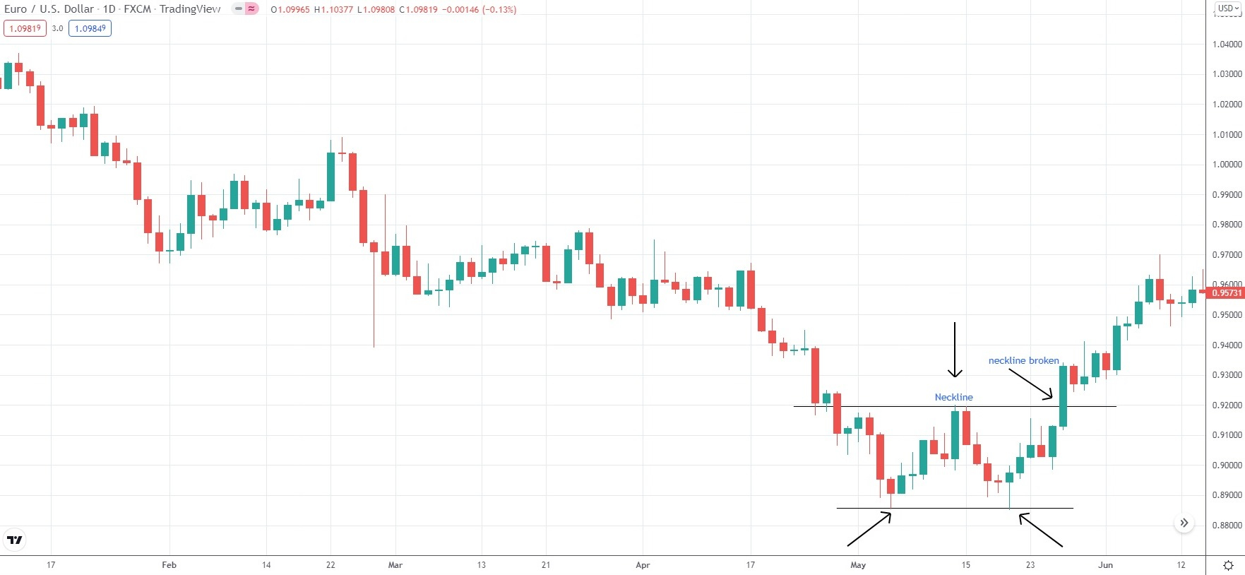
The Double Bottom is a bullish reversal pattern that resembles the letter “W” and typically forms after a downtrend. It signals a potential opportunity for traders to enter long positions. In this pattern, the price reaches two troughs separated by a peak, with a “neckline” forming at the top of the formation.
A valid Double Bottom pattern generally displays the following key characteristics:
- the initial price will enter the pattern from above the peak price level, while the exit will be on the breakout above the neckline
- the two troughs will usually be identical or within 5% of their price level
- the formation will be confirmed when the market closes above the high price of the top part
- the formation will fail when the market closes below the second trough
- the pattern will form in a period of 2 to 7 weeks. The longer the period of the formation, the less reliable it will be
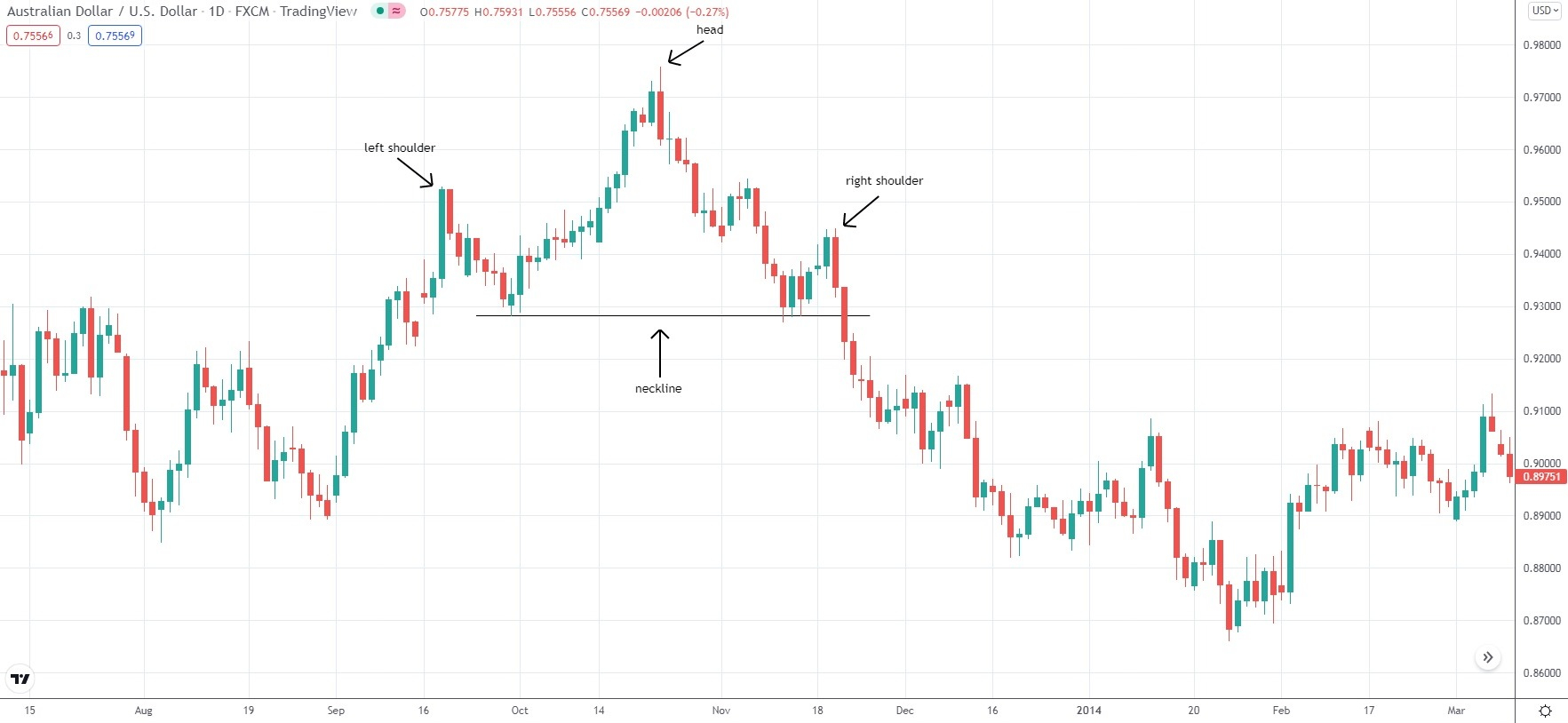
Head and Shoulders
The Head and Shoulders pattern is a classic reversal formation that typically appears after a bullish trend. When confirmed, it signals that the uptrend may be ending and a downward move is likely to follow. Its counterpart, the Inverse Head and Shoulders, forms after a downtrend and, if validated, indicates a potential end to the decline.
The pattern consists of three peaks: the left shoulder, the head, and the right shoulder. The head is the highest peak, while the two shoulders are usually of similar height.
The formation begins with the left shoulder, which marks a high during the current uptrend. The price then retraces to form a trough (low), which may be at or above the trend line, helping define the future neckline. From this trough, a new higher peak emerges—the head of the pattern. After the head forms, the price typically falls below the previous trend line, signaling a shift in momentum. The second trough formed after the head helps finalize the neckline’s placement.
The rebound from this trough forms the right shoulder, which is generally lower than the head and roughly matches the height of the left shoulder. The pattern is confirmed when the price drops from the right shoulder and closes below the neckline, usually with at least one full candle.
While the neckline is ideally horizontal, it often slopes upward or downward. A downward-sloping neckline is generally considered more bearish than an upward-sloping one.
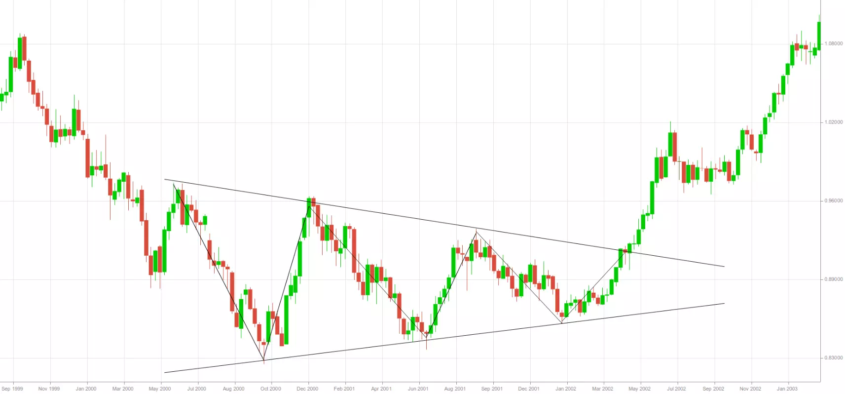
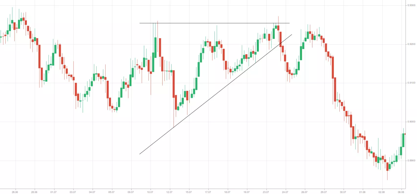
Triangles
Sometimes, price patterns form with boundary lines that are not parallel. If extended, these lines eventually converge, creating a formation known as a triangle. There are three main types of triangles: symmetrical, ascending, and descending.
A symmetrical triangle features a lower boundary that slopes upward and an upper boundary that slopes downward, creating an overall horizontal direction. Within this formation, the price makes lower highs and higher lows at roughly the same pace. Both boundary lines generally have similar angles, though in opposite directions. Price action typically fills the triangle, and the price must touch each boundary at least twice.
Symmetrical triangles are usually considered trend continuation patterns, signaling a temporary pause or consolidation rather than a reversal. During this time, bulls and bears are evenly matched until a decisive breakout occurs, indicating the next directional move.
The chart below illustrates a symmetrical triangle, followed by a breakout to the upside.
Ascending triangles are chart formations with a rising lower boundary and a horizontal upper boundary, which acts as a resistance line. Within this pattern, the price forms higher lows while the resistance line prevents it from moving higher until a breakout occurs. This pattern shows that bulls are gaining strength, as each successive low is higher than the previous one, while the bears’ influence gradually weakens.
Although sellers can temporarily push the price away from the resistance, their force diminishes over time. Buyers continue to step in at higher levels, steadily driving the price toward the resistance line until it eventually breaks through. Typically, the breakout occurs in the direction of the triangle—upward—but in some cases, it can break in the opposite direction.
The chart below illustrates an ascending triangle with a breakout to the downside.
Descending triangles are chart patterns with a declining upper boundary and a horizontal lower boundary, which acts as a support line. Within this formation, the price forms lower highs while the support line prevents it from falling further until a breakout occurs. This pattern indicates strong selling pressure, as each successive high is lower than the previous one, while the bulls’ influence gradually weakens.
Although buyers can temporarily push the price away from the support, their strength diminishes over time. Sellers continue to increase their positions, driving the price closer to the support line until it eventually breaks below it. Typically, the breakout happens in the direction of the triangle—downward—but it can occasionally occur in the opposite direction.
The chart below shows a descending triangle with a breakout to the upside.
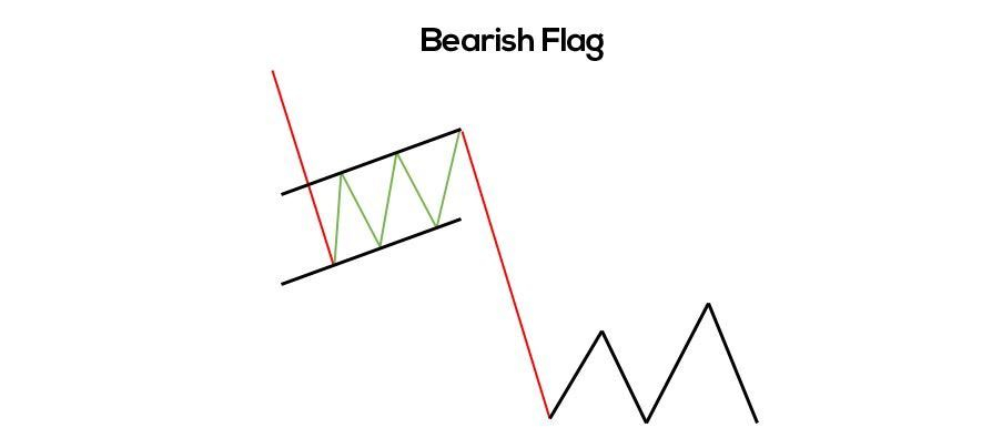
Flags and Pennants
Flags and pennants are short-term continuation patterns that appear frequently in the market. While they may resemble wedges, rectangles, or triangles, they are typically much smaller in size.
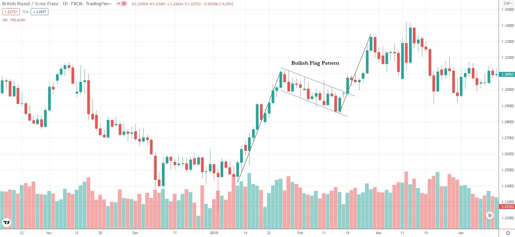
Flags are small, sloped channels that usually tilt against the direction of the preceding trend and are often preceded by a sharp price movement. These patterns tend to develop over a brief period, ranging from a few days to a few weeks. During the formation of a flag, a noticeable decrease in trading volume is commonly observed.
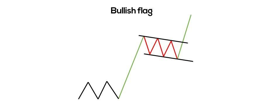
The daily chart below visualizes a bullish flag pattern.
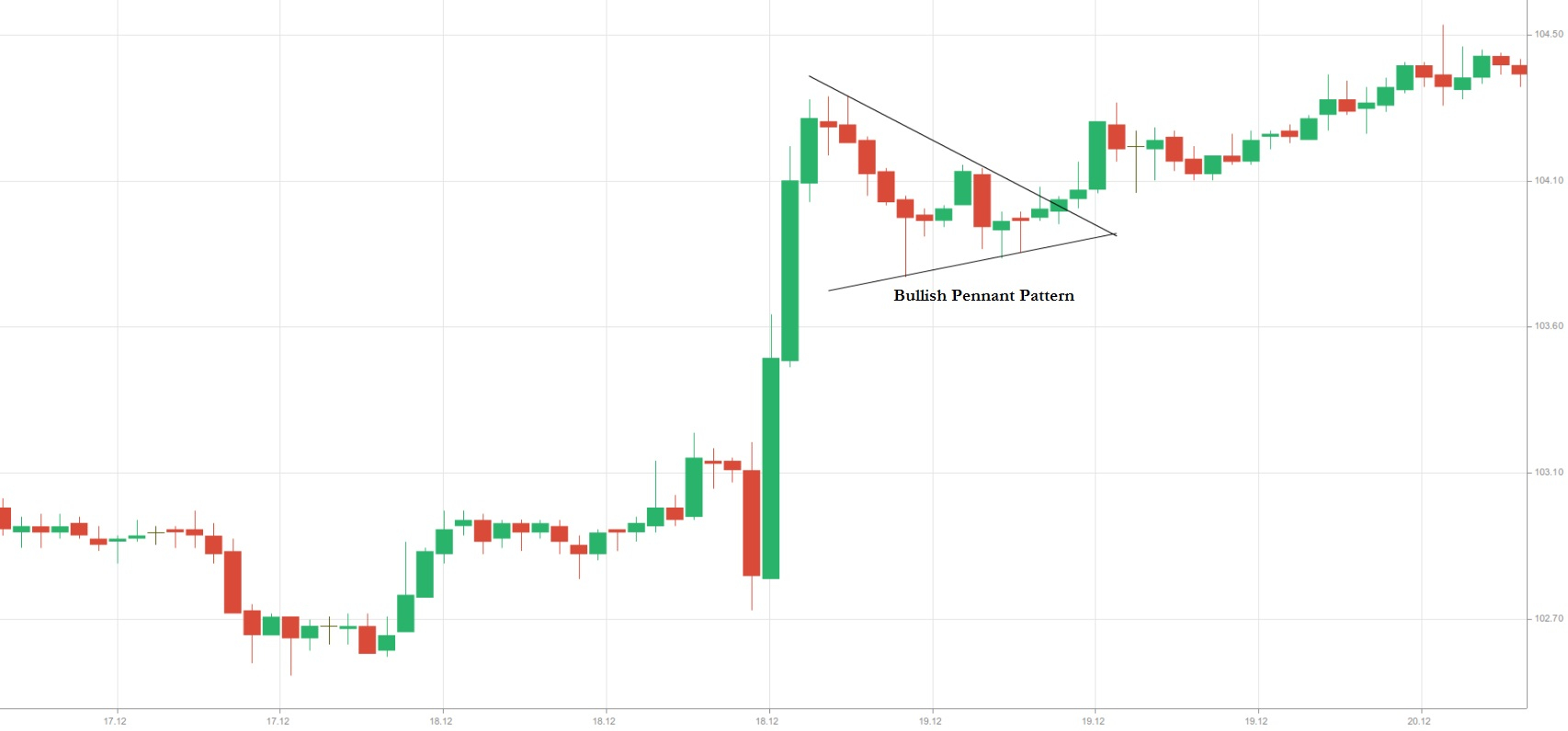
Pennants are very similar to flags, with the key difference being that their trend lines converge to form a small triangle. Like flags, pennants usually slope against the direction of the preceding trend. During the formation of a pennant, trading volume typically decreases, but once the breakout occurs, volume tends to surge, confirming the continuation of the trend.
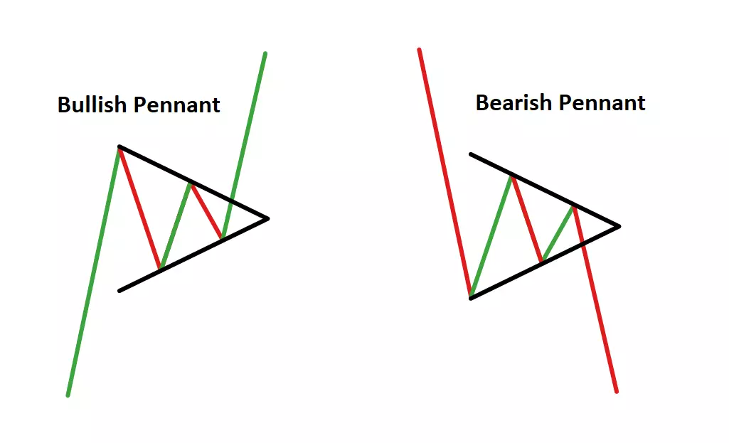
To spot flags and pennants, traders first look for a sharp price movement that precedes the pattern. Many prefer to wait until the pattern fully forms before entering a trade, typically at the breakout that follows. A valid breakout usually occurs in the same direction as the preceding trend.
For a long position, a trader might enter when the price breaks above the upper trend line (resistance), placing a Stop-Loss just below the lower trend line (support). Conversely, for a short position, a trader may enter when the price breaks below the lower trend line (support), with a Stop-Loss positioned above the upper trend line (resistance).
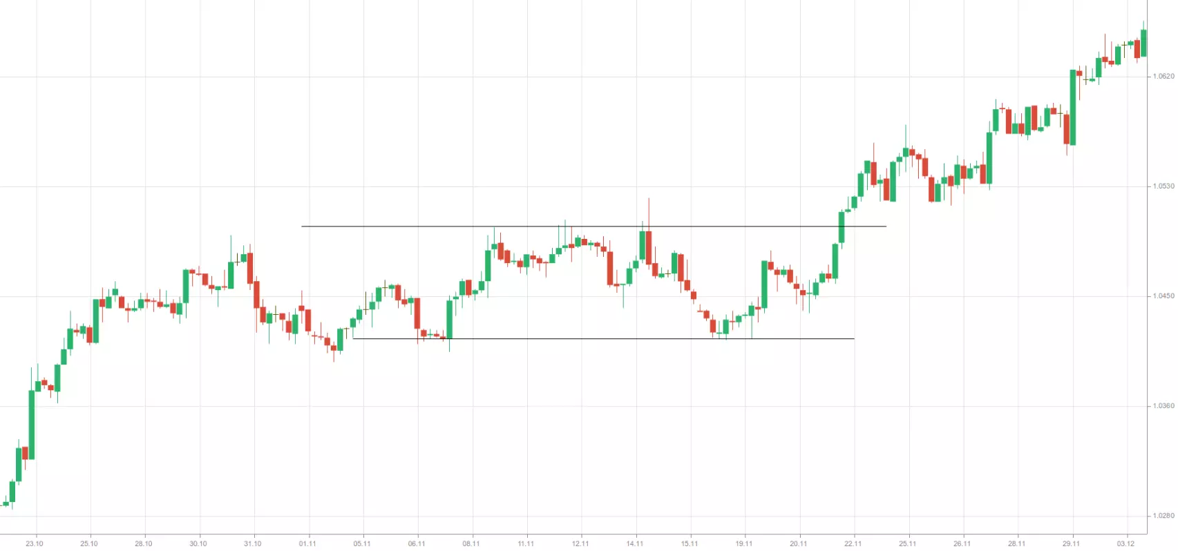
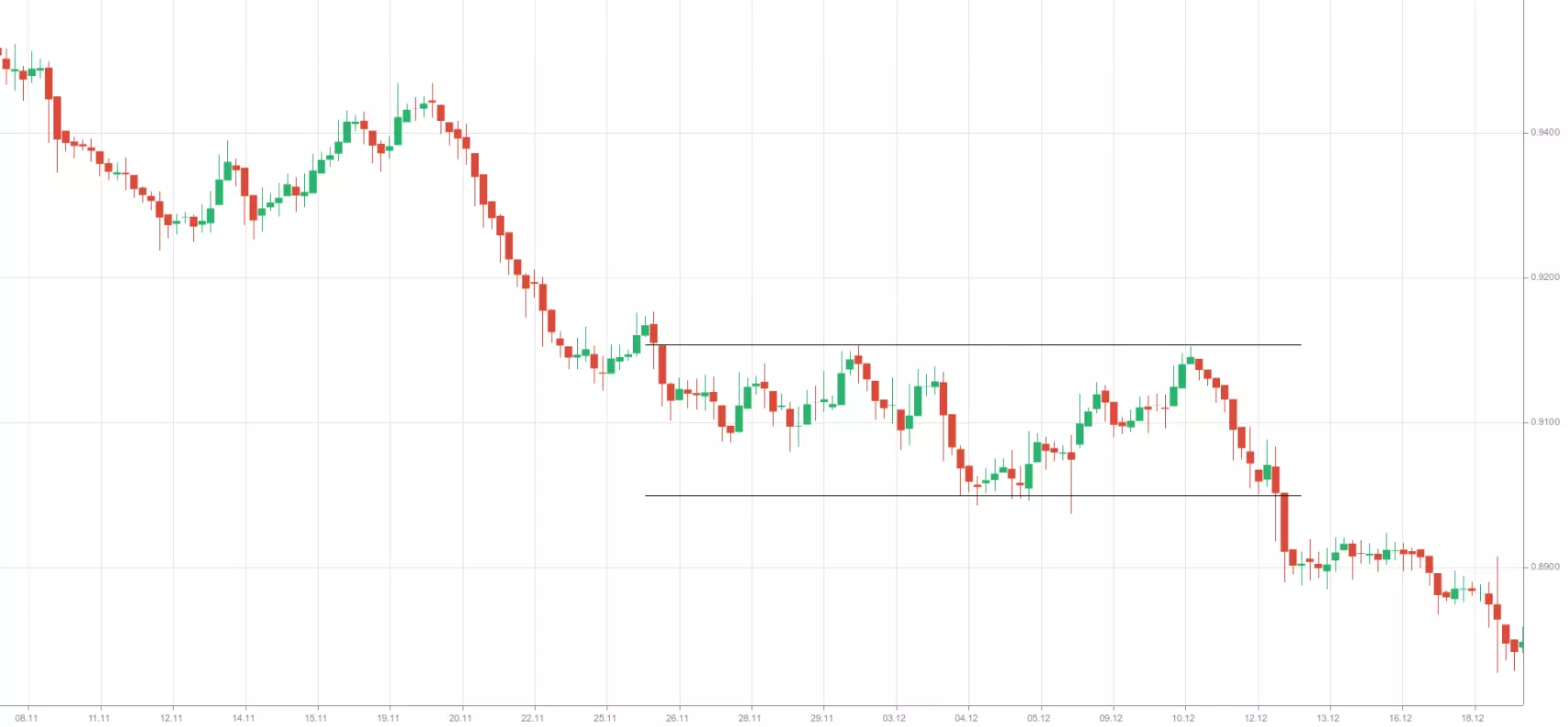
Rectangles
A rectangle formation appears on a chart when the price moves between two horizontal lines, with the upper line acting as resistance and the lower line as support. These boundaries should act as trend lines, or the price should touch each line at least twice. Within the rectangle, the price fluctuates between the two parallel lines until a breakout eventually occurs in one direction.
Sometimes, the price may not exactly reach the boundaries of the rectangle, instead showing small “shortfalls” before reversing within the range.
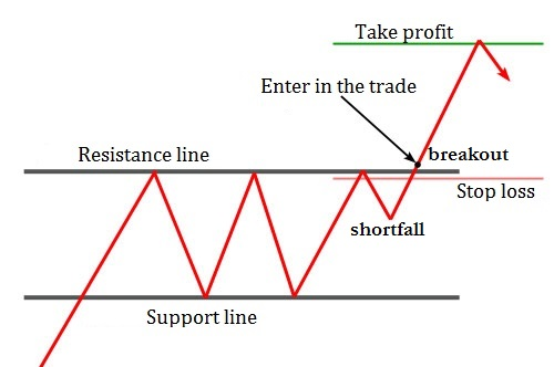
Rectangles can often produce “false breakouts,” which do not indicate the direction of the real breakout. These minor breakouts occur just above or below the rectangle’s boundaries and then quickly move back inside the range, usually in the opposite direction of the eventual breakout.
Rectangle patterns can signal either trend reversals or trend continuation. When acting as reversal patterns, they are commonly seen at market bottoms. When signaling continuation, rectangles can be bullish or bearish. A bullish rectangle forms when the price is in an uptrend before the pattern appears. During the rectangle’s formation, the price consolidates for a period before the upward trend resumes.
A bearish rectangle forms when the price is already in a downtrend before the pattern develops. During the rectangle’s formation, the price consolidates within the range for a period, after which the downward trend resumes.
Conclusion
One of the greatest strengths of technical analysis is its versatility. You don’t need a degree in economics to read a price chart effectively. Technical principles—such as trends, trading ranges, support, and resistance—can be applied across a wide range of markets, including Forex, stocks, cryptocurrencies, and commodities.
That said, mastering technical analysis is not necessarily easy. Success requires studying its many facets, dedicating time to develop and test a strategy, and staying adaptable to the ever-changing market conditions. Those who commit to this process can leverage technical analysis to make more informed trading decisions.